Currently there are almost 5 billion mobile internet users worldwide, which occupies more than half of the internet traffic. What does this mean? This means you can’t assume that most of your website visitors are desktop users. As the experience of browsing a website on desktop doesn’t always transfer to smartphones and tablets, you need to design your website for mobile users. Here are some tips to optimize your website’s mobile experience!
(1) Develop empathy for your users
To create an experience that suits your customers, you need to gain their empathy. Watch how they interact with your mobile website, hear their pain points, and get a sense of how they feel. Observe what they try to carry out, and how they carry out. In the process, you will start to figure out what you could address in a redesign. Also, a customer journey map could help you in learning the typical user’s experience with your company.
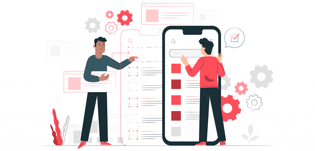
(2) Simplify the interface
A simple interface is a user-friendly interface. Mobile devices have a small screen for the users, and, mostly you would only have the essential space to work with. Mobile is not the place for excess, so remove anything that users don’t need. However, simple doesn’t mean to be boring, you can still create an impressive mobile website design. But more importantly, simplify your website to include the same content on your desktop and mobile website. All users deserve the same information, although it is presented in different layouts to fit different devices.
(3) Implement responsive design
A responsive website automatically adopts its content to the accessing devices, whether is a desktop, tablet or mobile phone. A responsive design works as a website targets the size of the browser to match how much space is available, and displays the website properly. From a practical standpoint, responsive design is the most cost-effective and less resource-intensive way than alternatives, like creating a separate website for desktop and mobile. With proper planning and testing your website’s responsive design, your website could look great on any screen.
(4) Don’t forget the speed
We are all very impatient. According to Google research, the probability of a bounce increases by 32% when page time increases from 1 to 3 seconds. Website speed is a make-or-break aspect for any website. Unfortunately, many websites still overlook the speed. Since mobile devices typically process data more slowly than desktop, a slow desktop website means a very slow mobile website. To retain your traffic, keep performance in mind throughout your design process. Set a performance standard for your mobile website and work to stay below it, your user will be less likely to leave.
Conclusion
Like many aspects of running a WordPress website, speed optimization is your responsibility. Fortunately, there are several ways that can help to optimize your website loading speed and provide the most satisfying user experience. It is worth spending a bit of your time to save your visitors a lot of time.
TRANSFORM YOUR BUSINESS TODAY!
Realizing the importance of digital transformation, The Malaysian government has introduced various initiatives to encourage SME digitalization. The Malaysia government through the Ministry of Finance (MOF) is working together with Bank Simpanan Nasional, SME Bank, and Malaysia Digital Economy Corporation (MDEC) in managing the grant to eligible Small & Medium Enterprises (SMEs) to adopt digitalization in daily operations.
Get your Matching Grant up to RM 5,000 with SME Digitisation Initiative now, for any Digital Media Marketing & Video Production services from SBS.